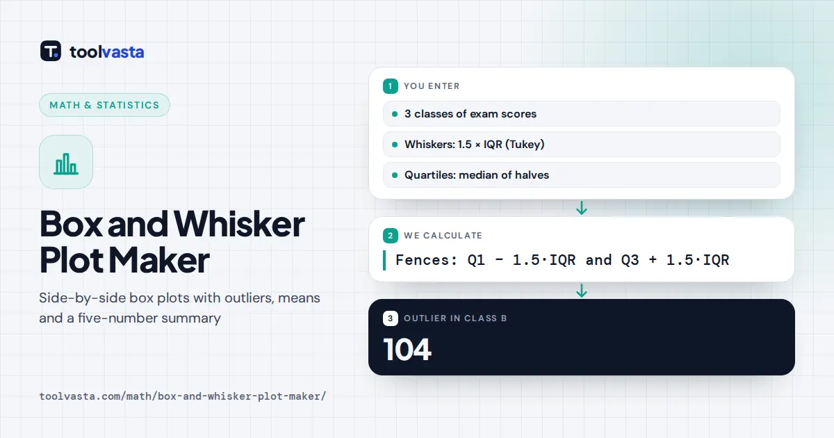
How to Use the Box and Whisker Plot Maker
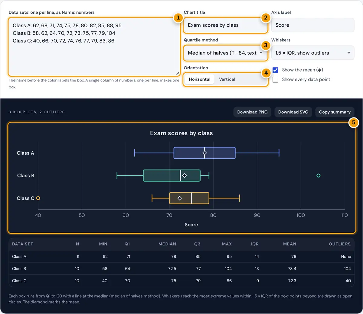
- Type each data set on its own line as Name: numbers. One column of numbers makes one box.
- Add a chart title and an axis label for the downloaded image.
- Choose the quartile method, then the whisker rule: 1.5 × IQR, 3 × IQR or min to max.
- Switch between horizontal and vertical boxes and tick the mean or data point options.
- Read the plot and the summary table, then download it as a PNG or SVG.
Type each data set on its own line, starting with a name and a colon, for example “Class A: 62, 68, 71”. Numbers can be separated by commas or spaces. If you paste a single spreadsheet column with one number per line, it becomes one box.
Add a chart title and an axis label, then choose the quartile method and the whisker rule. The default draws Tukey-style whiskers that stop at the last value within 1.5 × IQR of the box and shows anything further out as an outlier. Switch between horizontal and vertical boxes, and tick the options to mark the mean or show every data point.
The table under the chart lists the five-number summary, the IQR, the mean and the outliers for each set. Download the chart as a PNG for documents and slides, or as an SVG for sharp printing and editing.
How to Read a Box and Whisker Plot
The box covers the middle half of the data, from the first quartile (Q1) to the third quartile (Q3). The line inside the box is the median. The whiskers show how far the rest of the data reaches, and separate circles mark values unusual enough to count as outliers.
- A wider box means more spread in the middle 50 percent of the data.
- A median closer to one end of the box, or one whisker much longer than the other, suggests skewed data.
- When boxes for two groups barely overlap, the groups probably differ in a meaningful way. Use a formal test such as ANOVA to check.
The Five-Number Summary and Whisker Rule
IQR = Q3 − Q1
Lower fence = Q1 − 1.5 × IQR Upper fence = Q3 + 1.5 × IQR
Whiskers end at the most extreme data values inside the fences
Quartiles can be found in several ways. The default, median of halves, matches the TI-84 and most textbooks. You can switch to Tukey hinges or to the inclusive and exclusive formulas used by Excel. The quartile calculator on this site explains each method in detail.
Worked Example
Class B scored 58, 62, 64, 70, 72, 73, 75, 77, 79 and 104. With ten values, the median is the mean of the 5th and 6th: (72 + 73) ÷ 2 = 72.5. The lower half 58, 62, 64, 70, 72 gives Q1 = 64, and the upper half 73, 75, 77, 79, 104 gives Q3 = 77.
| Step | Class B |
|---|---|
| IQR | 77 − 64 = 13 |
| Lower fence | 64 − 1.5 × 13 = 44.5 |
| Upper fence | 77 + 1.5 × 13 = 96.5 |
| Whiskers | 58 to 79 |
| Outliers | 104 |
The score of 104 lies above the upper fence, so the right whisker stops at 79 and 104 is drawn as a separate circle. In the same chart, Class C has a low outlier of 40, while Class A has none.
When to Use a Box Plot
Box plots are ideal for comparing several groups at a glance: test scores by class, delivery times by courier, or blood pressure readings by treatment. They summarize hundreds of values in a small space and highlight differences in center, spread and skew. For a single small data set, a dot plot or histogram can show more detail, so try ticking “Show every data point” to combine both views.
Tips and Limits
- Each data set needs at least 3 values. Boxes from very small samples can change a lot when one value changes.
- Different software uses different quartile methods, so small differences from Excel or a graphing calculator are normal. Match the method to compare like for like.
- An outlier is a flag for a closer look, not proof of an error. Check the value before removing it.
- The downloaded image uses a white background and colors that also print well in grayscale.
Frequently asked questions
How do you make a box and whisker plot?
Find the minimum, Q1, median, Q3 and maximum. Draw a box from Q1 to Q3 with a line at the median, then draw whiskers out to the smallest and largest values that are not outliers.
Can I compare several data sets on one box plot?
Yes. Put each data set on its own line with a name and a colon. The plot maker draws up to eight boxes on the same scale, which makes differences in center and spread easy to see.
How are outliers shown on a box plot?
Values more than 1.5 times the IQR below Q1 or above Q3 are drawn as separate circles, and the whiskers stop at the most extreme values inside those limits. You can switch to 3 times the IQR or plain minimum to maximum whiskers.
What does the diamond on the box plot mean?
The diamond marks the mean of the data set. Comparing it with the median line shows skew: a mean well above the median suggests a long right tail, and a mean below it suggests a long left tail.
Why does my box plot differ from Excel's?
Excel box and whisker charts use their own quartile setting, either inclusive or exclusive median. Choose the matching quartile method here and the boxes will agree. Small samples show the biggest differences between methods.
How do I download the box plot?
Use Download PNG for a high resolution image to paste into documents or slides, or Download SVG for a vector file that stays sharp at any size and can be edited in design software.