How to Use the Text Shadow Generator
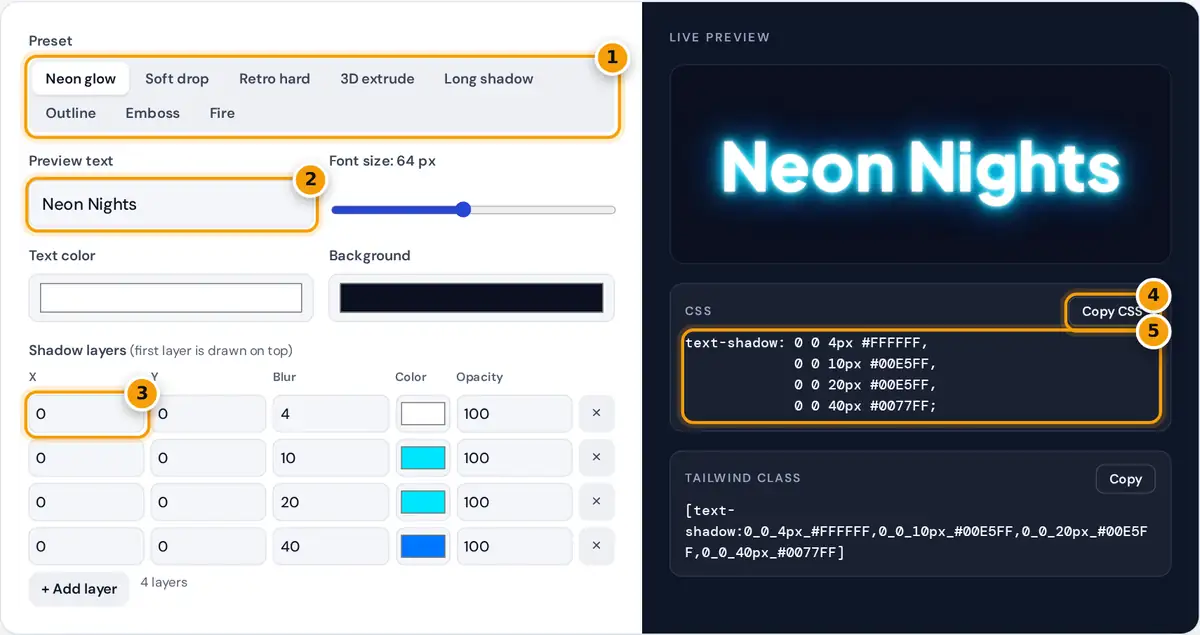
- Pick a preset such as Neon glow, 3D extrude or Fire.
- Type your own preview text and set the font size and colors.
- Edit each layer's X, Y, blur, color and opacity, or add layers.
- Copy the CSS, or the Tailwind class below it.
- Paste the text-shadow rule into your stylesheet.
Start with a preset: Neon glow, soft drop, retro hard shadow, 3D extrude, long shadow, outline, emboss or fire. The preview shows the effect on your own text, at your font size and colors. Then edit the layers: each row is one shadow with an X offset, a Y offset, a blur radius, a color and an opacity. Add up to 20 layers or remove the ones you do not need. The CSS panel always shows the exact text-shadow declaration, ready to paste into your stylesheet, and a matching Tailwind arbitrary class.
The CSS Text-Shadow Syntax
The text-shadow property is defined in the CSS Text Decoration specification from the W3C. Each shadow takes two offsets, an optional blur radius and a color. Several shadows are separated by commas and are painted in order, with the first shadow on top.
positive x moves right, positive y moves down, blur 0 gives a hard edge
Worked Example
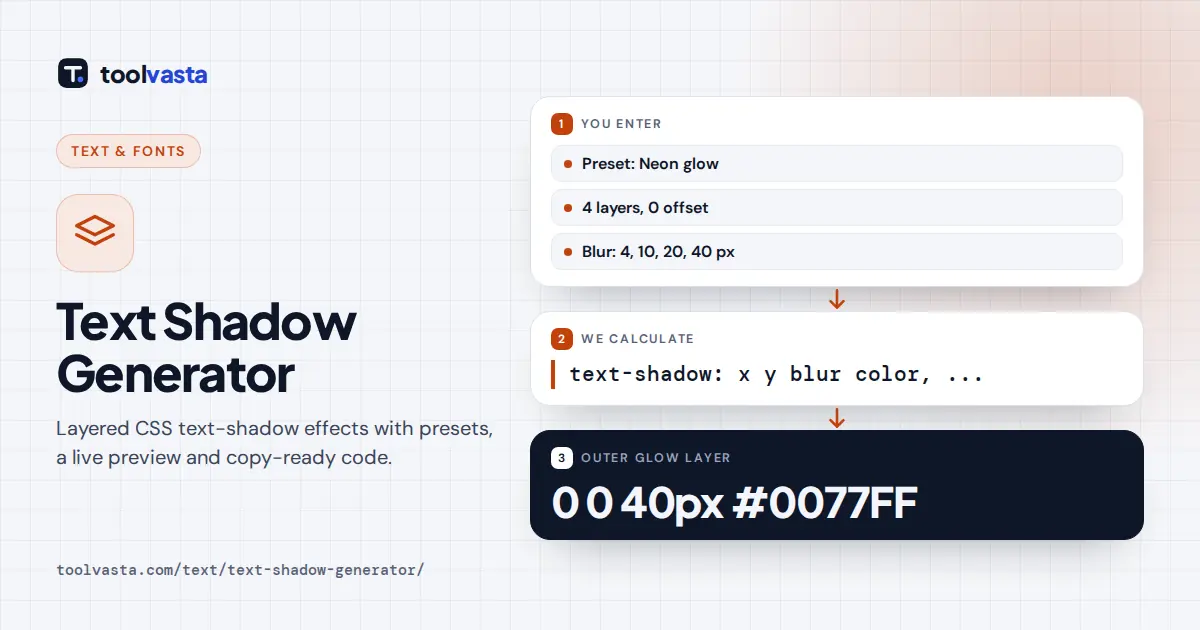
The soft drop preset has one layer: X 2, Y 2, blur 4, black at 35% opacity. Black is #000000, so the color becomes rgba(0, 0, 0, 0.35) and the CSS is text-shadow: 2px 2px 4px rgba(0, 0, 0, 0.35);. The neon preset stacks four glows with no offset, so the light spreads evenly around the letters: 0 0 4px #FFFFFF, 0 0 10px #00E5FF, 0 0 20px #00E5FF, 0 0 40px #0077FF. Zero values are written as plain 0, since CSS does not need a unit for zero.
How the Presets Are Built
| Preset | Layers | Technique |
|---|---|---|
| Neon glow | 4 | Zero offsets, growing blur, bright color |
| 3D extrude | 5 | 1px steps that darken, then one soft drop |
| Long shadow | 12 | Hard copies stepping 1px down and right |
| Outline | 4 | Hard shadows offset in four diagonal directions |
| Emboss | 2 | Light shadow up-left, dark shadow down-right, text matches background |
| Fire | 5 | Shadows rising upward from white to yellow to red |
Design and Performance Tips
- Keep contrast. A shadow can make text look sharper, but it does not fix weak color contrast. Check the text color against the background on its own.
- Use big effects on big text. Neon, 3D and fire work for headings and logos. Body text needs at most a subtle 1px shadow, or none.
- Watch performance. Many layers with large blur on long or animated text cost rendering time on older phones. The long shadow preset uses blur 0, which is cheap.
- Use opacity rather than gray. Semi-transparent black adapts to any background, while a fixed gray only looks right on one.
Animating a Text Shadow
Shadows can change on hover or focus for interactive buttons and links. Put a subtle shadow in the normal state and a stronger one in the :hover state, then add transition: text-shadow 0.2s ease so the change is smooth. Browsers can animate between two shadow lists most smoothly when both have the same number of layers, so keep matching layer counts, or add a transparent layer to the shorter list.
Using the Tailwind Class
Tailwind CSS supports arbitrary properties written in square brackets, with underscores in place of spaces. The generator converts your shadow into that format, so you can paste a class such as [text-shadow:2px_2px_4px_rgba(0,0,0,0.35)] directly into your markup. Newer Tailwind versions also include text-shadow utilities, but the arbitrary class gives you the exact multi-layer effect.
Limits
text-shadow cannot add an inner shadow, a gradient or a true stroke. For crisp outlines on large headings, -webkit-text-stroke is an alternative, though it is drawn over the letters and thins them. The preview uses this site's display font, so shadows may look slightly different with your own font, size and weight.
Frequently asked questions
How do I add a shadow to text in CSS?
Use the text-shadow property with an X offset, a Y offset, an optional blur radius and a color, for example text-shadow: 2px 2px 4px rgba(0, 0, 0, 0.35). Pick a preset here and copy the generated line.
How do I make neon glowing text with CSS?
Stack several shadows with zero offset and increasing blur in a bright color, such as 0 0 10px, 0 0 20px and 0 0 40px in cyan, on a dark background. The Neon glow preset shows the exact code.
Can I use more than one text shadow?
Yes. Separate shadows with commas. They are painted in order, so the first shadow sits on top. This generator supports up to 20 layers, which covers long shadows and 3D effects.
How do I make a text outline with text-shadow?
Add four hard shadows with zero blur offset in each diagonal direction, such as -2px -2px, 2px -2px, -2px 2px and 2px 2px. The Outline preset does this and works in every modern browser.
Does text-shadow work in all browsers?
Yes. text-shadow, including multiple shadows, is supported by all current versions of Chrome, Edge, Firefox and Safari on desktop and mobile, so the generated CSS needs no vendor prefixes.
Does text-shadow affect accessibility?
A shadow does not change how screen readers read text, but it can affect legibility. Keep strong contrast between text and background, avoid heavy blur on body text and test on a phone.