How to Use the LinkedIn Font Generator
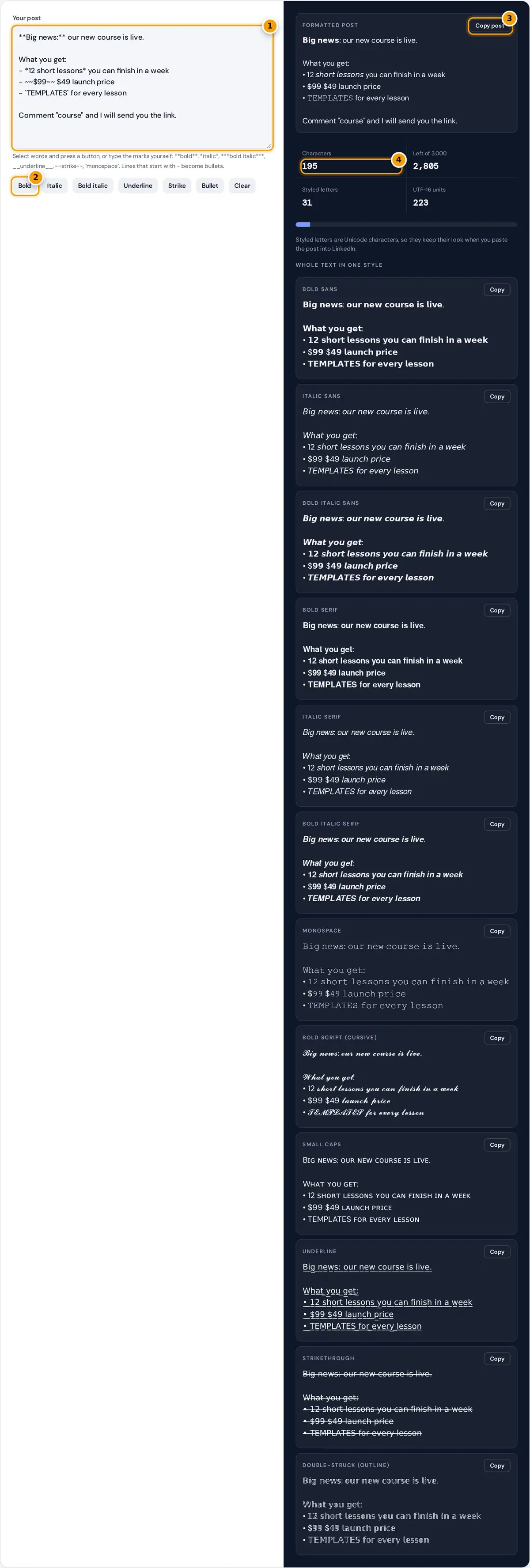
- Write your LinkedIn post. Put **two asterisks** around words to bold them, or *one* for italic.
- Or select words and press Bold, Italic, Underline, Strike or Bullet to add the marks for you.
- Press Copy post and paste the formatted post into LinkedIn.
- Check the character count stays under the 3,000 character post limit.
Write or paste your post in the box. To make words bold, select them and press Bold, or type two asterisks on each side like **this**. The same works for italic, bold italic, underline, strikethrough and monospace, and any line that starts with a dash becomes a bullet. The formatted post on the right updates as you type, and Copy post copies it ready to paste into LinkedIn.
Below the post you can also turn the whole text into one style, which is handy for a headline, a section title or the first line of your About section.
Why LinkedIn Needs Unicode Fonts
LinkedIn posts, comments, headlines and profile sections accept plain text only. There is no bold or italic button in the regular post editor, so the usual trick is to replace letters with Unicode characters that already look bold or italic. They come from the Mathematical Alphanumeric Symbols block, which was created for math notation and is supported by current phones and computers.
italic sans small = U+1D622 + (position − 1) bold sans digit = U+1D7EC + digit
underline and strikethrough: each character + U+0332 or U+0336
Worked Example
In "Big news", B is the 2nd letter, so bold sans B is U+1D5D4 + 1 = U+1D5D5 (𝗕). The small i is the 9th letter: U+1D5EE + 8 = U+1D5F6 (𝗶). Marked as **Big news:**, the line becomes 𝗕𝗶𝗴 𝗻𝗲𝘄𝘀:. The colon has no bold form, so it stays normal. In the default post, the text has 195 characters and 31 of them are styled.
Which LinkedIn Font Style to Use
| Style | Sample | Best for |
|---|---|---|
| Bold sans | 𝗞𝗲𝘆 𝗿𝗲𝘀𝘂𝗹𝘁 | Hooks, key numbers, section labels |
| Italic sans | 𝘧𝘰𝘳 𝘦𝘹𝘢𝘮𝘱𝘭𝘦 | Quotes, book titles, gentle emphasis |
| Bold italic sans | 𝙄𝙢𝙥𝙤𝙧𝙩𝙖𝙣𝙩 | One standout word per post |
| Monospace | 𝙲𝙾𝙳𝙴 | Code, commands, product names |
| Strikethrough | $̶9̶9̶ | Old prices, crossed out ideas |
Sans styles match the LinkedIn interface font, so they look the most natural. Serif bold, script and double-struck stand out more but can look out of place in a professional feed.
Character Limits and Counting
LinkedIn currently allows up to 3,000 characters in a post. The counter shows characters as people see them, plus UTF-16 units. Each styled letter is a single character on screen but takes two UTF-16 units in memory, and some systems count those units. If a long post with a lot of styling is rejected, trim a few lines.
Where Styled Text Works on LinkedIn
Because the result is ordinary Unicode text, you can paste it anywhere LinkedIn accepts typed text: posts, comments, direct messages, your headline, the About section, job descriptions in the Experience section, featured links and company page updates. Articles and newsletters written in the LinkedIn article editor already have real bold and italic buttons, so use those there instead, because real formatting stays readable for screen readers and search.
A good pattern for a post is a short bold hook on the first line, one blank line, then two or three short paragraphs or a bulleted list with one bold phrase each. Readers in the feed see only the first lines before the post is folded, so the hook carries most of the work.
Tips and Accessibility
- Bold the hook and a few key phrases, not whole paragraphs. Readers skim, and too much bold hides the message.
- Screen readers may read styled letters one by one or skip them, so never put essential facts, names or links only in a styled font.
- Do not style hashtags or names you want found. LinkedIn search matches normal letters.
- Bullets made with • and short lines are easier to read on phones than long blocks of text.
- Check the post on your phone before publishing. Long words in bold sans are wider than normal text and can wrap earlier than you expect.
Everything happens in your browser. Your draft is not uploaded or stored, so it is safe to prepare announcements before they are public.
Frequently asked questions
How do I write in bold on LinkedIn?
Type your post here and put two asterisks around the words, like **this**, or select them and press Bold. Copy the formatted post and paste it into LinkedIn. The bold letters are Unicode characters, so they keep their look.
Does bold text hurt my LinkedIn reach?
There is no official statement that styled characters reduce reach. The real costs are accessibility and search, since screen readers and LinkedIn search treat styled letters differently, so use them for a few key words only.
Can I use these fonts in my LinkedIn headline and About section?
Yes. Any field that accepts text, including your headline, About section, experience descriptions and comments, accepts these Unicode characters. Your name field may be checked more strictly, so keep your name in normal letters.
Why does the counter show two different numbers?
Characters counts what you see on screen. UTF-16 units count how the text is stored, and each styled letter takes two units. If LinkedIn rejects a long styled post, the stored length is usually the reason.
How do I add bullet points to a LinkedIn post?
Start a line with a dash and a space, or press the Bullet button. The generator turns it into a round bullet character, so your list stays neat when you paste it into LinkedIn.
Will the formatting look the same on phones?
Current iPhone, Android, Windows and Mac devices include these characters, so the post looks the same in the app and the browser. Very old devices may show empty boxes for some styled letters.