How to Use the Color Palette Generator
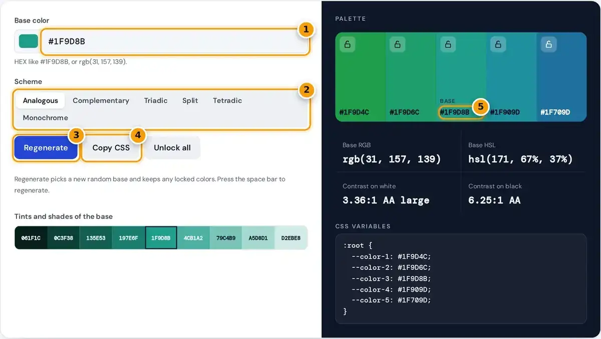
- Type a HEX or rgb() base color, or use the picker beside it.
- Pick a harmony: analogous, complementary, triadic, split, tetradic or monochrome.
- Press Regenerate or the space bar for a new random base. Locked colors stay put.
- Copy the whole palette as CSS variables for your stylesheet.
- Click any HEX code to copy it, then read its RGB, HSL and WCAG contrast below.
Start with a base color. Use the color picker or type a HEX code such as #1F9D8B, or paste an rgb() value. Then choose a scheme, and the five-color palette updates instantly as you type.
Click any swatch's HEX code to copy it, or copy RGB and HSL values from the table beneath the tool. That table also shows the WCAG contrast of every color against white and black text.
Found a color you like? Press its lock icon. The Regenerate button, or the space bar, then builds a fresh palette around a new random base while every locked swatch stays exactly where it is.
Color Harmony Schemes Explained
Each scheme follows classic color theory. It rotates the hue of your base color around the color wheel while keeping its saturation and lightness, which is why the resulting colors feel related to each other.
| Scheme | Hue offsets | Character |
|---|---|---|
| Analogous | −30°, −15°, 0°, +15°, +30° | Calm and cohesive |
| Complementary | 0° and 180°, plus lighter and darker versions | High contrast, energetic |
| Triadic | 0°, 120°, 240° | Vivid but balanced |
| Split complementary | 0°, 150°, 210° | Contrast with less tension |
| Tetradic | 0°, 90°, 180°, 270° | Rich, needs one dominant color |
| Monochrome | 0° at five lightness levels | Minimal and elegant |
Analogous palettes are the safest color harmony for beginners, since neighbors rarely clash. Complementary pairs opposite hues for strong contrast, while triadic spaces three hues evenly and suits playful brands that still need visual balance.
Split complementary softens the clash of a straight complement, and tetradic gives four hues that need one clear leader. Monochrome keeps a single hue and changes only lightness, which is perfect for minimal, elegant interfaces.
WCAG Contrast Ratio
Every color is checked against white and black using the formula in the Web Content Accessibility Guidelines 2.2. Each color channel is first converted to linear light, then combined into a single relative luminance value.
contrast = (Llighter + 0.05) ÷ (Ldarker + 0.05)
AA: 4.5:1 normal text, 3:1 large text · AAA: 7:1
Level AA needs a contrast ratio of 4.5:1 for normal text and 3:1 for large text, while AAA needs 7:1. These limits matter greatly for accessibility, because low contrast text is hard for many readers.
As a worked example, pure red, #FF0000, scores 4.00:1 on white, passing only for large text, and 5.25:1 on black. The default teal scores 3.36:1 on white and 6.25:1 on black, so dark text wins.
HEX, RGB and HSL Color Codes
All three formats describe the same color in slightly different ways, and the tool shows each one. They are defined in the CSS Color Module, so any modern browser or design tool reads them correctly.
- HEX (#1F9D8B): three pairs for red, green and blue, each from 00 to FF.
- RGB (rgb(31, 157, 139)): the same channels as numbers from 0 to 255.
- HSL (hsl(171, 67%, 37%)): hue in degrees, then saturation and lightness as percentages.
HEX is the most common format in stylesheets and design files. RGB is especially handy when you need transparency through rgba, since you only add a fourth value for the opacity, between zero and one.
HSL is the easiest format for adjusting colors by hand. Raise the lightness to make a color paler or lower the saturation to mute it, all without changing the underlying hue that defines its character.
Tints and Shades
The strip under the controls mixes your base color with white to make tints and with black to make shades, in 20% steps. That gives you nine related colors, including the base in the middle.
Tints make especially good backgrounds, hover states and subtle highlights. Shades suit borders, pressed buttons and text on light backgrounds. Click any step to copy its HEX code straight into your stylesheet or design file.
Because mixing with white or black keeps the hue, a full scale from one color looks consistent. Build light and dark scales this way for buttons, alerts and charts that belong to the same family.
Exporting Your Palette to CSS
Copy CSS gives you a ready :root block with five custom properties named --color-1 to --color-5. Paste it into your main stylesheet, then reference each value with the var() function anywhere else in your project.
Rename the CSS variables after pasting, such as --brand, --accent and --surface, so the names describe purpose rather than order. Meaningful names turn a palette into reusable design tokens that a whole team can share.
The same HEX codes work in Figma, Sketch, presentation software and print briefs. For print work, ask your printer to convert them to CMYK, because screen colors and printed inks do not always match exactly.
Tips for Using a Palette
Follow the 60-30-10 rule: one dominant color covers about 60% of a design, a secondary color 30% and an accent color the final 10%. Add neutrals such as off-white and charcoal for text and backgrounds.
Most user interfaces also need semantic colors for success, warning, error and information messages. Derive them from your brand colors by matching saturation and lightness, so status messages still feel part of the same palette.
Choose a mood before you choose hues: cool blues feel calm, warm oranges feel energetic. HSL lightness is not perceived evenly, and yellow looks lighter than blue at equal values, so always check by eye.
Frequently asked questions
How do I choose colors that go together?
Start from one color you like and apply a harmony scheme. Analogous palettes are the safest choice, while complementary and triadic palettes add more contrast. Always check text contrast before you finalize the palette.
How do I generate a random color palette?
Press Regenerate or the space bar. The generator picks a new random base color and builds a palette with the selected harmony scheme, keeping any swatches you have locked in place.
What contrast ratio do I need for accessible text?
WCAG AA requires at least 4.5:1 for normal text and 3:1 for large text. AAA requires 7:1 for normal text. The table under the tool grades every color against white and black.
How do I keep a color when regenerating?
Click the lock icon on that swatch. Regenerate then changes only the unlocked colors, so you can keep a brand color fixed while exploring new combinations around it. Unlock all clears every lock.
Can I export the palette to CSS?
Yes. Copy CSS gives a :root block with --color-1 to --color-5 custom properties. Paste it into your stylesheet and rename the variables to match their purpose, such as brand or accent.
How many colors does a website palette need?
Most sites work well with one primary color, one or two accents, a set of neutrals for text and backgrounds, and semantic colors for success, warning and error states, each with a few tints and shades.