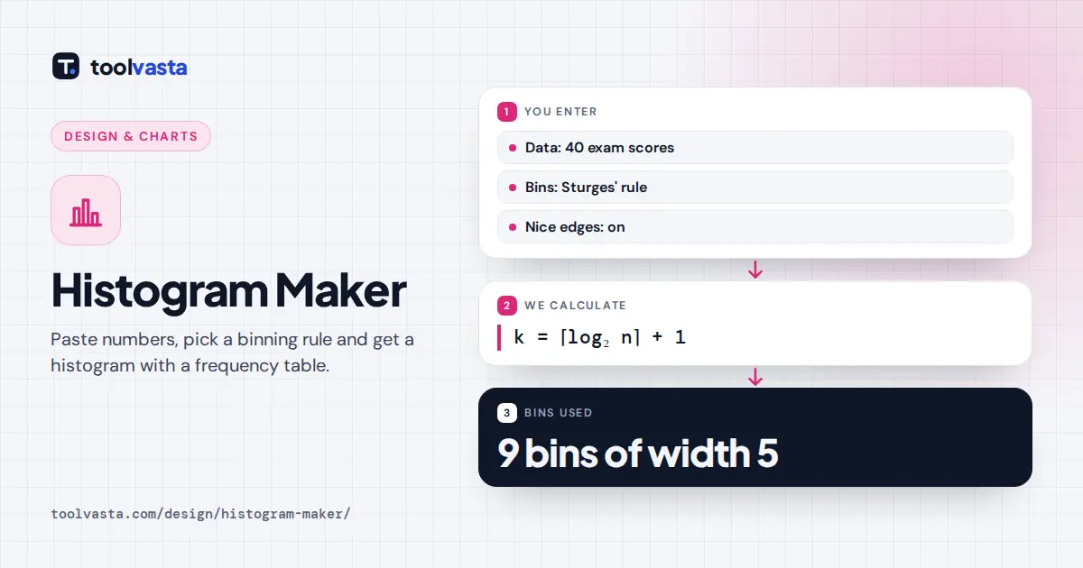
How to Use the Histogram Maker
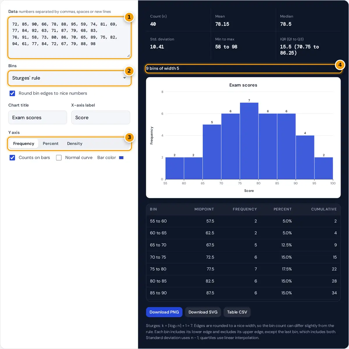
- Paste or type your numbers, separated by commas, spaces or lines.
- Choose a bin rule or a custom bin count or width.
- Show frequency, percent or density on the y axis.
- Read the bins, chart and frequency table, then download.
- Paste or type your numbers. Commas, spaces, tabs and new lines all work, so you can paste a column straight from a spreadsheet.
- Choose how to set the bins: a rule (Sturges, Freedman-Diaconis, Scott, square root or Rice), a custom number of bins, or a custom bin width and starting point.
- Keep Round bin edges to nice numbers on for readable labels such as 55, 60, 65, or turn it off to use the rule's exact width.
- Pick frequency, percent or density for the y axis, and add counts on the bars or a normal curve.
- Read the summary statistics and the frequency table, then download the chart as PNG or SVG and the table as CSV.
Bin Width Rules Compared
The number of bins changes how a histogram looks. Too few bins hide the shape, and too many make it noisy. Each rule balances that differently. Here n is the number of values, s the sample standard deviation and IQR the interquartile range.
Square root: k = ⌈√n⌉ Rice: k = ⌈2 × ∛n⌉
Freedman-Diaconis: h = 2 × IQR ÷ ∛n
Scott: h = 3.49 × s ÷ ∛n
| Rule | Sets | Good for |
|---|---|---|
| Sturges | Number of bins | Small, roughly bell-shaped samples |
| Freedman-Diaconis | Bin width, from the IQR | Skewed data and data with outliers |
| Scott | Bin width, from the standard deviation | Roughly normal data |
| Square root | Number of bins | Quick default, used by many spreadsheets |
| Rice | Number of bins | Larger samples, a few more bins than Sturges |
Worked Example
The sample is 40 exam scores from 58 to 98, so the range is 40. The mean is 78.15, the median 78.5 and the sample standard deviation 10.41. The quartiles, found by linear interpolation, are Q1 = 70.75 and Q3 = 86.25, so the IQR is 15.5.
- Sturges: log₂ 40 = 5.32, so k = 6 + 1 = 7 bins and a raw width of 40 ÷ 7 = 5.71. Rounded to a nice width of 5 starting at 55, the scores fall into 9 bins with counts 2, 2, 5, 6, 7, 6, 6, 4 and 2.
- Freedman-Diaconis: h = 2 × 15.5 ÷ ∛40 = 31 ÷ 3.42 = 9.06, which rounds to a nice width of 10. The bins 50 to 60, 60 to 70, 70 to 80, 80 to 90 and 90 to 100 hold 2, 7, 13, 12 and 6 scores.
- Exact Sturges (nice edges off): 7 bins of width 5.71 starting at 58 hold 4, 5, 7, 7, 7, 7 and 3 scores.
Reading a Histogram
- Shape: a single peak in the middle suggests a roughly symmetric distribution. A long tail to the right means right skew; to the left, left skew.
- Center and spread: compare the mean and median. When the mean sits well to one side of the median, the data are skewed toward that side.
- Gaps and outliers: isolated bars far from the rest deserve a closer look.
- Density scale: with density on the y axis, bar areas add up to 1, which lets you compare histograms with different bin widths and overlay the normal curve fairly.
Notes and Limits
Bins are left-closed: a value equal to an edge goes into the bin that starts there, and the maximum goes into the last bin. A histogram is for one numeric variable; to compare categories, use a bar chart instead. Everything is calculated in your browser, and your data never leaves your device. Large datasets of up to 100,000 values are supported, and the CSV export gives you the frequency table for a spreadsheet or report.
Frequently asked questions
How do I make a histogram?
Paste your numbers into the data box. The tool groups them into bins, draws the histogram and builds the frequency table. Choose a binning rule or your own bin width, then download the chart.
How many bins should a histogram have?
There is no single answer. Sturges' rule gives about 7 bins for 40 values. Freedman-Diaconis adapts the width to the spread of the middle half of the data and copes better with skew and outliers.
What is the Freedman-Diaconis rule?
It sets the bin width to 2 times the interquartile range divided by the cube root of n. Because it uses the IQR rather than the standard deviation, outliers barely affect the width.
What is the difference between a histogram and a bar chart?
A histogram shows the distribution of one numeric variable, with touching bars over continuous intervals. A bar chart compares separate categories, and its bars usually have gaps between them.
Which bin does a value on an edge go into?
Each bin includes its lower edge and excludes its upper edge, so a score of 60 with bins 55 to 60 and 60 to 65 goes into 60 to 65. The last bin also includes its upper edge.
What does the density option show?
Density divides each bin's frequency by n times the bin width, so the total area of the bars equals 1. It is the right scale for comparing with a normal curve.