How to Use the CSS Gradient Generator
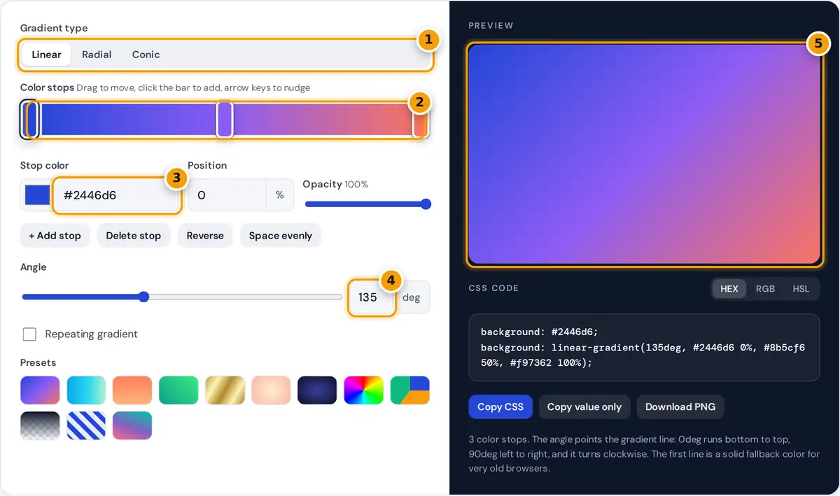
- Choose a linear, radial or conic gradient.
- Drag the stop handles to move colors, or click the bar to add a new stop.
- Select a stop and set its color by hex code or picker, then adjust position and opacity.
- Set the angle in degrees. 90deg runs left to right and 180deg runs top to bottom.
- Check the live preview, then copy the CSS or download the gradient as a PNG.
- Choose Linear, Radial or Conic.
- Click a stop handle on the color bar to select it, then pick a color, type a hex code, set its position or lower its opacity. Drag handles to move them, click an empty part of the bar to add a stop, or select a handle and use the arrow keys (Shift moves 10%).
- Set the angle for linear and conic gradients. For radial and conic gradients, click anywhere in the preview to move the center, or type exact X and Y percentages.
- Pick HEX, RGB or HSL for the color format, then press Copy CSS to copy both declarations, or Copy value only when you need just the gradient for a variable or a JavaScript style.
The presets are a fast starting point. Each one loads its type, angle and stops, and you can then edit everything. Nothing is uploaded: the generator, the preview and the PNG export all run in your browser.
CSS Gradient Syntax Explained
A CSS gradient is an image that the browser draws, so it goes in background or background-image, not in background-color. The three functions share the same list of color stops:
radial-gradient(<shape> at <x> <y>, color1 pos1, ...)
conic-gradient(from <angle> at <x> <y>, color1 pos1, ...)
Each stop is a color followed by a position along the gradient line. Between two stops the browser blends the colors smoothly. When two stops share the same position, the change is instant, which is how stripes and pie slices are made. Add repeating- in front of any function to tile the stop pattern, as the Stripes preset does. Linear and radial gradients are defined in the W3C CSS Images Module Level 3, and conic gradients were added in CSS Images Module Level 4.
How Gradient Angles Work
In CSS, 0deg points up and angles turn clockwise. That differs from math class, where 0 degrees points right and angles turn counterclockwise. The keyword forms are shortcuts for the same angles:
| Angle | Keyword | Direction of travel |
|---|---|---|
| 0deg | to top | Bottom to top |
| 90deg | to right | Left to right |
| 180deg | to bottom | Top to bottom (the default) |
| 270deg | to left | Right to left |
| 135deg | none (to bottom right on a square) | Top left to bottom right |
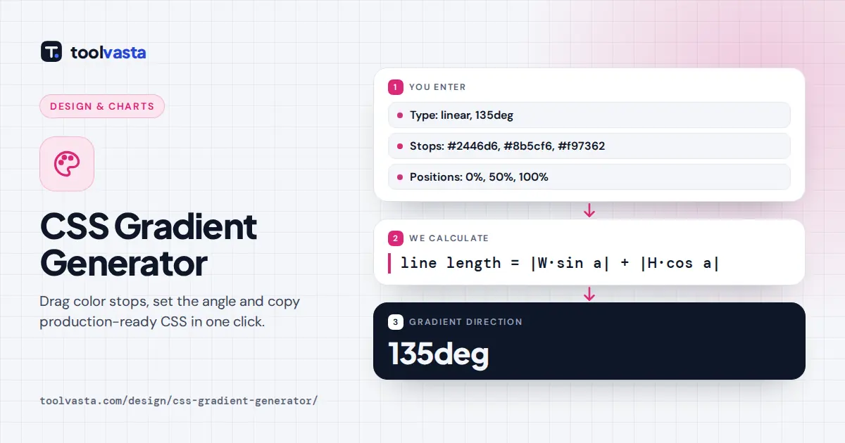
The gradient line passes through the center of the box, and its length is set so that the 0% and 100% stops land exactly on the corners: length = |W × sin a| + |H × cos a|.
Worked Example
The default gradient runs at 135deg. On a 1920 × 1080 hero banner, sin 135° = 0.7071 and cos 135° = −0.7071, so the line is 1920 × 0.7071 + 1080 × 0.7071 = 2,121.3 pixels long. The middle stop at 50% sits at the exact center of the banner, about 1,060.7 pixels from each end of the line. On a square box, 135deg and to bottom right give the same result. On a wide box they differ, because the keyword version adjusts the angle so the corners match.
Linear vs Radial vs Conic Gradients
| Type | Colors change | Good for |
|---|---|---|
| Linear | Along a straight line | Hero backgrounds, buttons, fades |
| Radial | Outward from a center point | Glows, spotlights, vignettes |
| Conic | Around a center point | Pie charts, color wheels, loaders |
Radial gradients here use the CSS default size, farthest-corner, so the last stop reaches the corner farthest from the center. Circle keeps the gradient round. Ellipse stretches it to the box proportions.
Tips for Smooth, Readable Gradients
- Fade to transparent with the same color. Fading to the keyword
transparentcan pass through gray in some tools. The Fade to clear preset keeps one color and lowers only the opacity. - Avoid banding on large areas by keeping colors close in lightness or adding a third stop between them.
- Check text contrast. If text sits on the gradient, test it against the lightest and the darkest part.
- Keep the fallback line. It gives a solid color if a gradient fails to load in an email client or very old browser.
Exporting a Gradient as an Image
Download PNG draws the same gradient on a 1920 × 1200 canvas, which suits wallpapers, slide backgrounds and social images. Use CSS on websites, though: it is only a few bytes, it scales to any screen and it can be changed later without exporting a new file.
Frequently asked questions
How do I add a gradient background in CSS?
Use the background or background-image property with a gradient function, for example background: linear-gradient(90deg, #2446d6 0%, #f97362 100%). Copy the code from this generator and paste it into your stylesheet rule.
What is the difference between linear and radial gradients?
A linear gradient changes color along a straight line at the angle you set. A radial gradient changes color outward from a center point, as a circle or an ellipse, which suits glows and spotlights.
What does a conic gradient do?
A conic gradient sweeps colors around a center point, like the hands of a clock. It is ideal for pie charts, color wheels and loading rings. All current versions of major browsers support it.
How do I make a hard line between two colors?
Give two stops the same position, such as blue 50% and orange 50%. The browser switches color instantly at that point instead of blending, which is how stripes and pie slices are created.
Can a gradient include transparency?
Yes. Lower the opacity of any stop and the generator writes it as an rgba or hsla color. Fading one color to zero opacity avoids the gray tint that the transparent keyword can cause.
Why does my gradient angle look different from design software?
CSS measures angles from the top and turns clockwise, so 90deg runs left to right. Many design apps measure from the right and turn counterclockwise, so the same number can point another way.