How to Use the Graph Maker
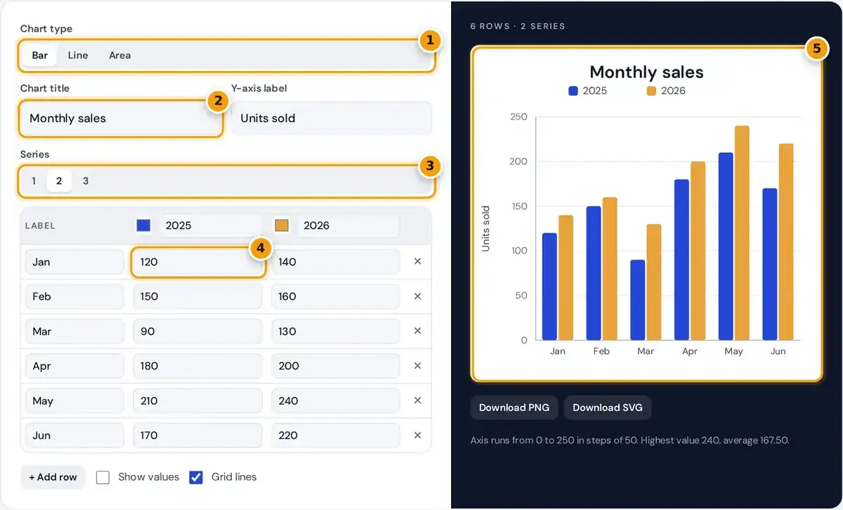
- Pick the chart type: bar, line or area.
- Give the chart a title, then add a Y-axis label beside it.
- Choose 1, 2 or 3 data series to compare.
- Type your labels and values in the table. Use + Add row for more categories.
- Check the live graph, then download it as a PNG image or a sharp SVG.
Pick Bar, Line or Area at the top, then type a chart title and a y-axis label. The live preview redraws with every keystroke, so you can see the result while you edit your numbers.
Choose one, two or three data series, rename each one in the table header and set its color. Each row in the table is one category or time period, and Add row appends another below.
Leave a cell empty when a value is missing, and the chart simply skips it. When the graph looks right, download it as a PNG image or an SVG vector file with a single click.
Which Chart Type Should You Use?
| Chart | Best for | Example |
|---|---|---|
| Bar graph | Comparing separate categories | Sales by region, votes by option |
| Line graph | Change over time | Monthly visitors, temperature by day |
| Area chart | Change over time with emphasis on volume | Energy use, cumulative sign-ups |
A bar graph is best when you compare separate categories, such as sales by region or votes by option. The length of each bar carries the value, so readers can rank items at a glance.
A line graph suits change over time, such as monthly visitors or daily temperature, since the line shows the trend. An area chart adds shading under the line to stress the volume behind each point.
For parts of a whole, a pie chart works better, and for the relationship between two measures you need a scatter plot. A histogram groups raw measurements into ranges, which needs a statistics tool instead.
How the Axis Scale Is Chosen
step = raw step rounded up to 1, 2, 2.5, 5 or 10 × 10n
axis top = step × ceiling(max ÷ step)
The graph maker sets the axis scale automatically with round tick values that are easy to read. It splits the data range into about five parts, then rounds each step up to a tidy number.
That tidy number is 1, 2, 2.5, 5 or 10 times a power of ten. The result is labels like 0, 50 and 100 rather than awkward values like 48 or 96 that confuse readers.
The axis always includes zero, so a bar's height stays proportional to its value. A zero baseline stops small differences from looking dramatic, which is a common way that charts become misleading, even by accident.
Worked Example
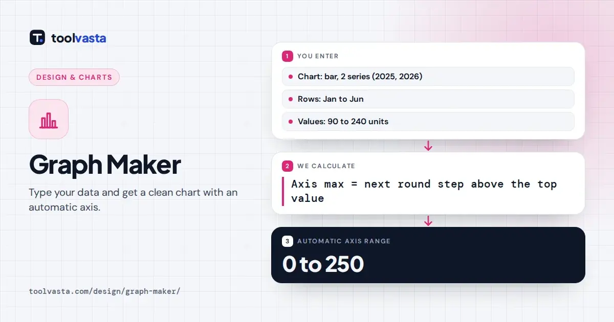
The sample data on the page runs from 90 to 240 units. Measured from zero the range is 240, so the raw step is 240 divided by 5, which gives 48 before any rounding happens.
The nearest power of ten below 48 is 10, and 4.8 rounds up to 5, so the step becomes 50. The axis top is 50 times the ceiling of 240 divided by 50, or 250.
The resulting ticks therefore read 0, 50, 100, 150, 200 and 250. Change the May value for 2026 to 500 and the step jumps to 100, with the axis now ending exactly at 500 instead.
Customizing Your Chart
Each series has a color picker in the table header, and a legend appears above the chart whenever you use more than one series. Use contrasting colors, and keep one color per meaning across charts.
Turn grid lines off for a cleaner look, or on to help readers trace values. Tick Show values to print the number above each bar or point when your audience really needs the exact figures.
Negative values are fully supported, and bars below zero hang down from the zero line. Long labels rotate automatically when space is tight, although short ones such as Jan instead of January still read faster.
PNG or SVG?
PNG downloads render at twice the preview size, which is 1440 by 880 pixels on a desktop screen. That high resolution keeps the image crisp in slides, reports and documents, even on very sharp displays.
SVG files are vector graphics described in the open W3C SVG standard, so they scale to any size without blur. You can edit them in Figma, Illustrator or Inkscape afterward, or embed them on websites.
Both formats export with a white background, so they sit cleanly on light pages and in print. The file name is taken from your chart title, which keeps several downloads easy to tell apart later.
Accessible and Honest Charts
Good data visualization starts with a title that states the point, such as Sales rose 20% in spring, rather than just Sales. Readers then know what to look for before they study the bars closely.
When you publish a chart online, add alt text that summarizes the key finding. The W3C guidance on complex images explains how to pair a chart with a short description and a fuller data table.
Strong color contrast between series helps readers with low vision or color blindness. Accessibility also improves when you avoid relying on color alone, for example by labeling lines directly or showing values on the bars.
Free, Private and Limits
This free chart maker has no sign-up and no watermark, and there is no limit on downloads. Everything runs locally in your browser, so the numbers you type are never uploaded or stored anywhere else.
The table holds up to 40 rows and three series, which covers most school projects, business reports and blog posts. You type values directly, and pasted numbers with thousands separators such as 1,200 are accepted.
There are no CSV imports or templates here. For large datasets or statistical charts, a spreadsheet or dedicated charting library is a better fit, but for quick bar and line charts this tool works well.
Frequently asked questions
Is this graph maker free?
Yes. There is no sign-up, no watermark and no limit on downloads. The chart is created entirely in your browser, so your data never leaves your device and nothing is stored on a server.
How do I make a line graph with two lines?
Choose Line, set Series to 2, give each series a name and color in the table header, and fill in both value columns. A legend appears automatically above the chart to identify each line.
Can I download my graph as an image?
Yes. Download PNG gives a high resolution image with a white background, ideal for documents and slides, and Download SVG gives a scalable vector file you can edit or embed in a web page.
Can I use negative numbers?
Yes. The axis extends below zero automatically and bars for negative values extend downward from the zero line. Line and area charts also dip below zero, and the axis labels adjust to fit.
Why does my axis start at zero?
Starting at zero keeps bar lengths proportional to the values, which avoids making small differences look large. It is the honest default for bar and area charts, where readers compare lengths and shaded areas.
What is the best free online graph maker for quick charts?
For quick bar, line and area charts with up to three series, a browser tool like this one is fastest. For pie charts, scatter plots or large datasets, a spreadsheet offers more chart types.