How to Use the Org Chart Maker
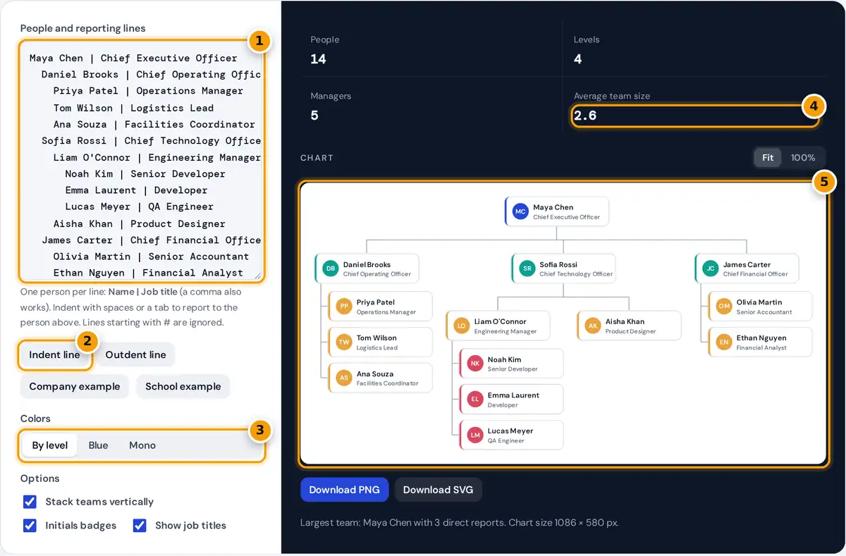
- Type one person per line as Name | Job title, and indent people under their manager.
- Use Indent line and Outdent line to change reporting lines without a Tab key.
- Pick colors by level, a blue scale or mono for printing.
- Check people, levels, managers and average team size.
- Review the chart, then download it as SVG or PNG.
- Type one person per line in the box, as Name | Job title. A comma works as the separator too, and the title is optional.
- Indent a line with spaces or the Tab key to make that person report to the nearest less-indented line above. Use Indent line and Outdent line on a phone, where there is no Tab key.
- Choose colors by level, a single blue scale or mono for print. Turn initials badges and job titles on or off.
- Keep Stack teams vertically on to list frontline staff in a column under their manager. This keeps wide teams readable. Turn it off for a classic fully horizontal tree.
- Download the chart as SVG for slides and documents that need sharp scaling, or as PNG at twice the screen size.
The chart redraws as you type. Names never leave your browser, which matters when you plan a restructure that is not public yet.
How the Outline Becomes a Chart
Each line is read from top to bottom. The tool remembers the chain of people above the current line and their indentation. A new line belongs to the nearest earlier line that is indented less than it, so you can use two spaces, four spaces or tabs, as long as you are consistent within a team.
level = number of managers above + 1
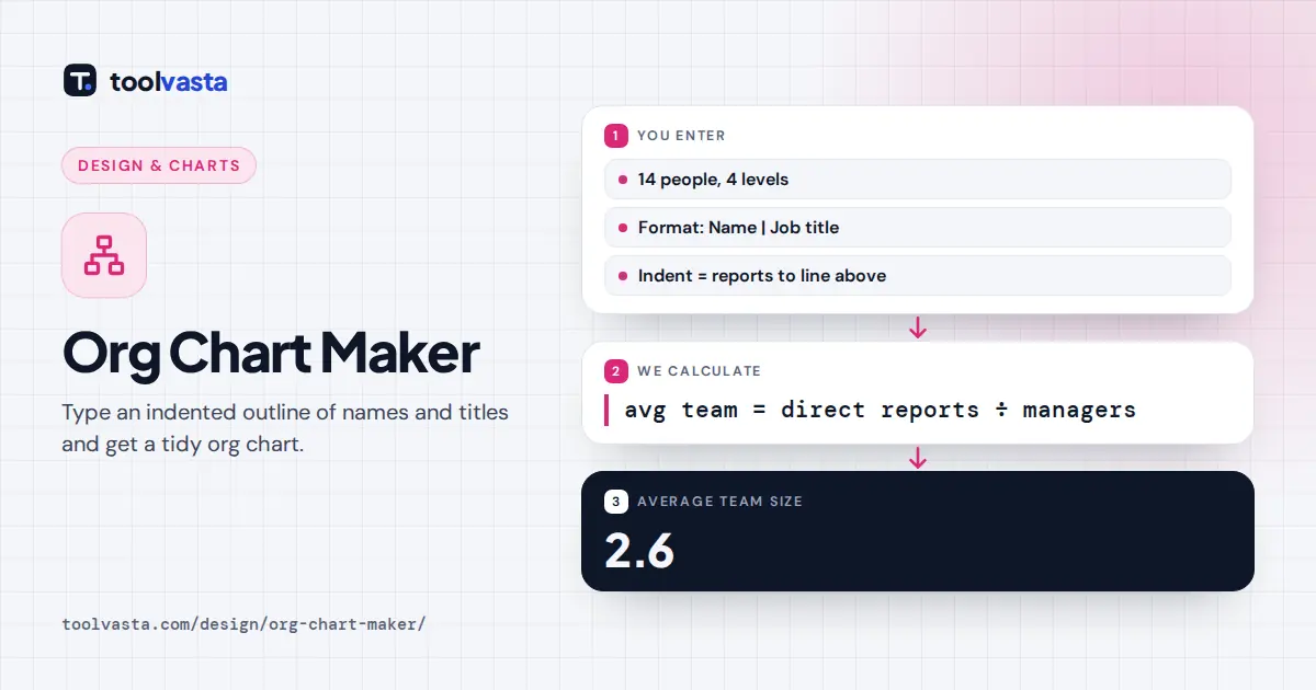
average team size = direct reports ÷ managers
The layout follows the layered tree style used in most organization charts. Each team is laid out first, then its manager is centered over the team, so reporting lines never cross.
Worked Example
The sample company has 14 people on 4 levels. Five of them manage someone: Maya Chen has 3 direct reports, Daniel Brooks 3, Sofia Rossi 2, Liam O'Connor 3 and James Carter 2. That is 13 reporting lines across 5 managers, so the average team size is 13 ÷ 5 = 2.6. Every person except the CEO has exactly one manager, which is why the reporting lines always total one less than the head count.
Span of control is the number of people a manager leads directly. Very small teams across many layers slow decisions down, while very large teams leave little time for coaching. The managers and average team size figures help you spot both patterns before you share the chart.
Types of Organizational Charts
| Structure | How it is organized | Typical for |
|---|---|---|
| Hierarchical | One leader, layers of managers | Most companies, schools, public bodies |
| Functional | Teams grouped by function such as finance or IT | Mid-size businesses |
| Divisional | Teams grouped by product, region or client | Large and international firms |
| Flat | Few levels, wide teams | Startups, small agencies |
This maker draws hierarchical, functional and divisional charts directly. Matrix structures, where people report to two managers, need a second chart or a note, because every line in the outline has one manager.
Tips for a Clear Org Chart
- Use official job titles and keep them short, such as Head of Finance rather than a full sentence.
- Show one department per chart once you pass about 40 people, and link the charts together in your handbook.
- Add vacant roles as lines like Open role | Data Analyst so planned hires are visible.
- Date the chart in the file name, because team structures change often.
- Ask before sharing names and photos outside your organization.
SVG or PNG?
SVG is a vector file. It stays sharp at any zoom, imports into PowerPoint, Google Slides, Keynote, Word and Figma, and its text remains editable in vector software. PNG is a regular image, exported at twice the chart size, which suits email, chat and intranet pages. Both have a white background, and the file name is org-chart, so rename it with a date before you share it.
Frequently asked questions
How do I make an org chart for free?
Type each person on a new line as Name, then a pipe or comma, then the job title. Indent people under their manager, and the chart draws itself. Download it as PNG or SVG with no sign-up.
How do I show who reports to whom?
Indent the person's line more than their manager's line, directly underneath it or under the manager's other reports. The tool connects every line to the nearest line above it with less indentation.
Can I put an org chart into PowerPoint?
Yes. Download the SVG and insert it as a picture in PowerPoint, Keynote or Google Slides. It stays sharp at any size. The PNG also works if you prefer a standard image.
Can the chart have more than one person at the top?
Yes. If several lines have no indentation, the tool draws separate trees side by side and says so below the chart. Indent them under one person to join them into a single hierarchy.
What does stack teams vertically do?
When everyone in a team has no reports, the team is listed in a column under the manager instead of in a long row. Charts stay narrow enough to fit a slide or a printed page.
Is there a limit on chart size?
The maker handles up to 250 people. Charts above about 40 people are easier to read when split by department, with one chart for leadership and one for each team.