How to Use the Pie Chart Maker
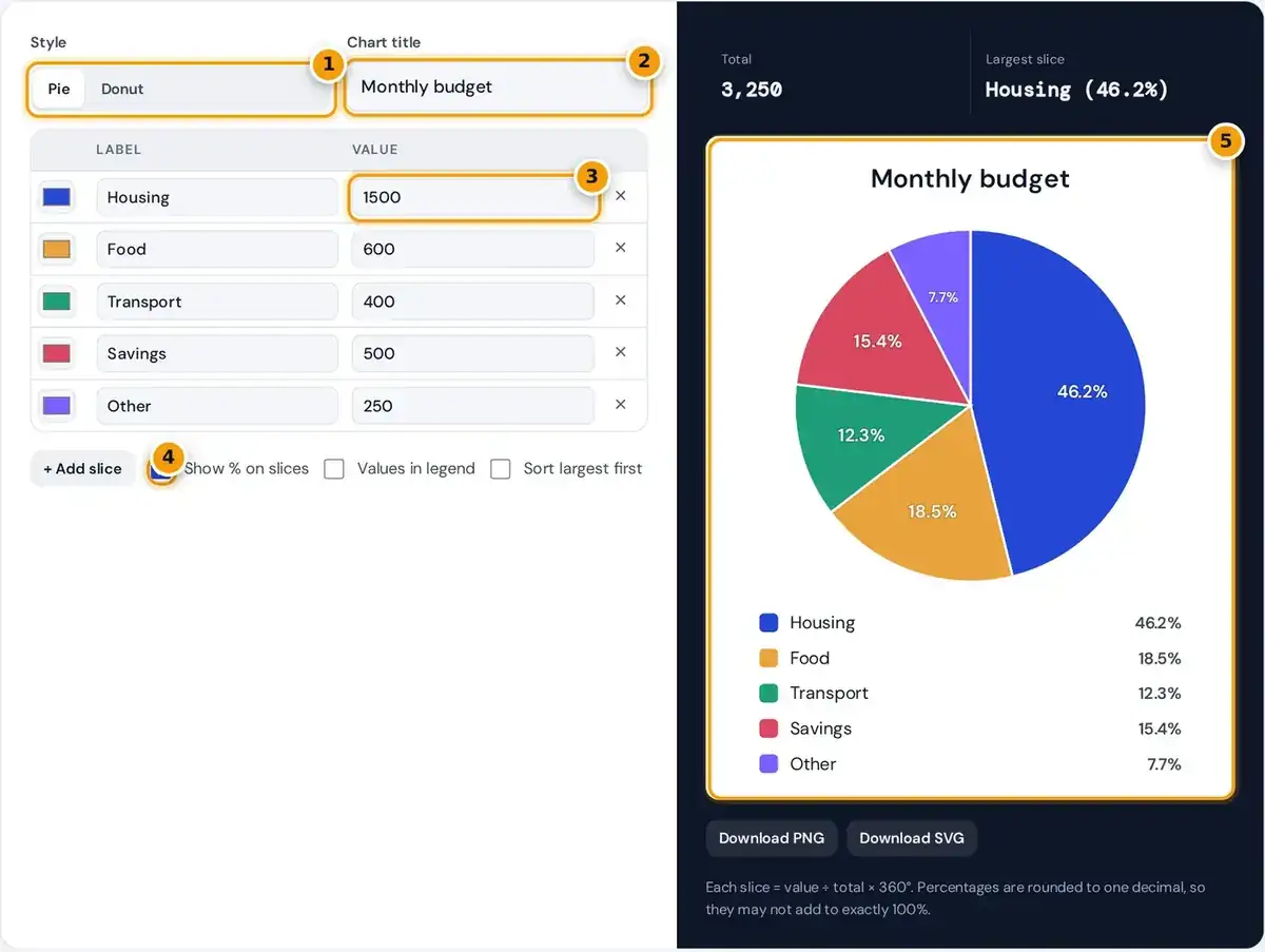
- Choose a classic pie or a donut chart.
- Type a title for the chart, such as Monthly budget.
- Enter a label and value for each slice. Use + Add slice for more rows.
- Toggle % on slices, values in the legend or largest-first sorting.
- Check the chart and legend, then download it as PNG or SVG.
Type a chart title, then enter one row per slice with a label and a value. Values can be raw numbers or percentages, because the tool works out each share of the total for you.
Click a color square to change a slice color, and press Add slice for more rows, up to 12. The live preview redraws with every keystroke, and there is no signup, watermark or upload involved.
Switch between Pie and Donut, choose whether to show percentages on slices and values in the legend, and tick Sort largest first if order matters. Then download the finished chart as a PNG or SVG.
How Percentages and Angles Are Calculated
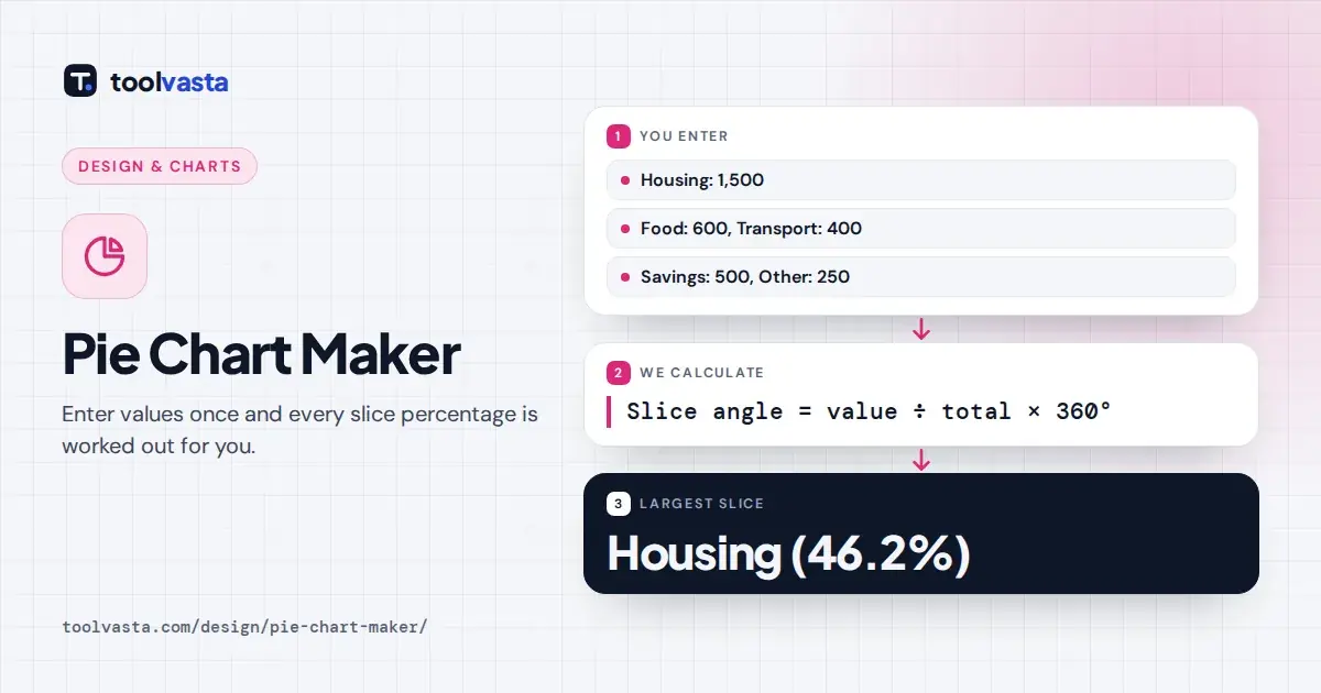
angle = value ÷ total × 360°
A pie chart shows parts of a whole. Each slice is its value divided by the total of all values, and that same proportion of 360 degrees sets the slice angle on the full circle.
The sample budget totals 1,500 + 600 + 400 + 500 + 250 = 3,250. Housing is 1,500 ÷ 3,250 = 46.2% of the total, which gives an angle of 166.2°. Food is 18.5%, Savings 15.4%, Transport 12.3% and Other just 7.7%.
Those rounded shares add to 100.1% because of rounding, which is normal. The chart itself uses the exact fractions, so the slices always close the circle at exactly 100% without any visible gap or overlap.
| Slice | Value | Share | Angle |
|---|---|---|---|
| Housing | 1,500 | 46.2% | 166.2° |
| Food | 600 | 18.5% | 66.5° |
| Savings | 500 | 15.4% | 55.4° |
| Transport | 400 | 12.3% | 44.3° |
| Other | 250 | 7.7% | 27.7° |
When to Use a Pie Chart
A pie chart, also called a circle graph, works best when one whole splits into a few categories. Examples are a household budget, survey results with one answer each, or market share within one industry.
Pie charts are easiest to read with two to six slices that clearly differ in size. Readers judge angles less precisely than lengths, so nearly equal slices blur together and the comparison quickly gets lost.
- Use a bar graph when values are not parts of one total, or when slices are nearly equal.
- Use a line graph for change over time.
- Group tiny slices into an Other category. Slices under 4% get no percentage label because it would not fit.
For classroom use, the Statistics Canada lesson on pie charts shows how each sector represents a share of the whole. It is a useful reference when teaching students to read and draw a circle graph.
Pie vs Donut Chart
A donut chart, sometimes spelled doughnut, is a pie chart with the center removed. The slice proportions are identical, and this tool places the total in the empty center, which is especially handy for dashboards.
Readers compare donut slices by arc length around the ring rather than by angle at the middle. Many readers find both formats equally easy to read, so the choice between them is mostly about style.
Pick the classic pie when the chart stands alone and the parts are the story. Pick the donut when you want the total visible at a glance, or when it sits beside other circular charts.
Design Tips for a Readable Pie Chart
- Start the largest slice at twelve o'clock and tick Sort largest first so slices run clockwise from biggest to smallest.
- Put the key message in the chart title, such as Housing takes almost half the budget.
- Avoid 3D pie charts, which distort the size of front slices.
The default color palette uses ten distinct hues chosen to contrast with each other. Change colors freely, but keep neighboring slices clearly different so each boundary stays visible when the chart is printed or projected.
Avoid pairing red and green side by side, because people with red-green color blindness may not tell them apart. Showing percentages on slices also means color is never the only way to read the chart.
That approach matches the W3C accessibility guidance on use of color. Good storytelling then comes from the title and the order: lead with the biggest slice and let the smallest ones fade quietly into Other.
Downloading as PNG or SVG
On a desktop screen the PNG image is exported at 1440 × 880 pixels on a white background, ready for presentations, reports and documents. Phones get a taller layout with the legend placed under the pie.
The SVG vector file keeps sharp edges at any resolution, so you can scale it for print or a website without losing quality. It also opens in design software if you need to edit colors.
Everything runs in your browser. The labels and values you type are never uploaded to a server, making the tool safe for private budgets, sales figures and other internal data you would rather keep offline.
Frequently asked questions
How do I calculate percentages for a pie chart?
Divide each value by the total of all values and multiply by 100. This maker does it automatically and shows the result on each slice and, if you choose, beside each label in the legend.
Can I enter percentages directly?
Yes. Type the percentages as values. If they add up to 100, each slice shows the same percentage you entered. If they do not, the tool rescales them so the whole chart still totals 100%.
How many slices can a pie chart have?
This tool allows up to 12 slices, but charts are easiest to read with six or fewer. Combine small categories into an Other slice so the main parts of the whole stand out.
What is the difference between a pie chart and a donut chart?
A donut chart has a hole in the middle, where this tool shows the total. The slice proportions are the same, so the choice between the two is mainly about style and layout.
Can I download the pie chart?
Yes. You can download a high resolution PNG image or a scalable SVG vector file, both with a white background, ready for slides, reports, documents and web pages.
When should I not use a pie chart?
Avoid a pie chart when values are not parts of one whole, when slices are nearly equal, or when you show change over time. A bar graph or line graph is clearer in those cases.